Overview
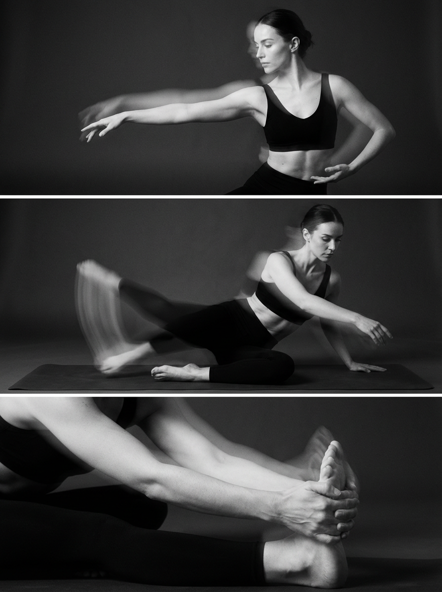
HUSH Studio operates in a space where movement is both physical and emotional. The brand needed to communicate strength and control without becoming loud or overstated. The challenge was to create an identity that feels quiet, intentional and confident while still carrying depth and tension. Rather than relying on trends within the wellness or fitness space, the goal was to build a visual language that feels timeless, focused and grounded in the body.
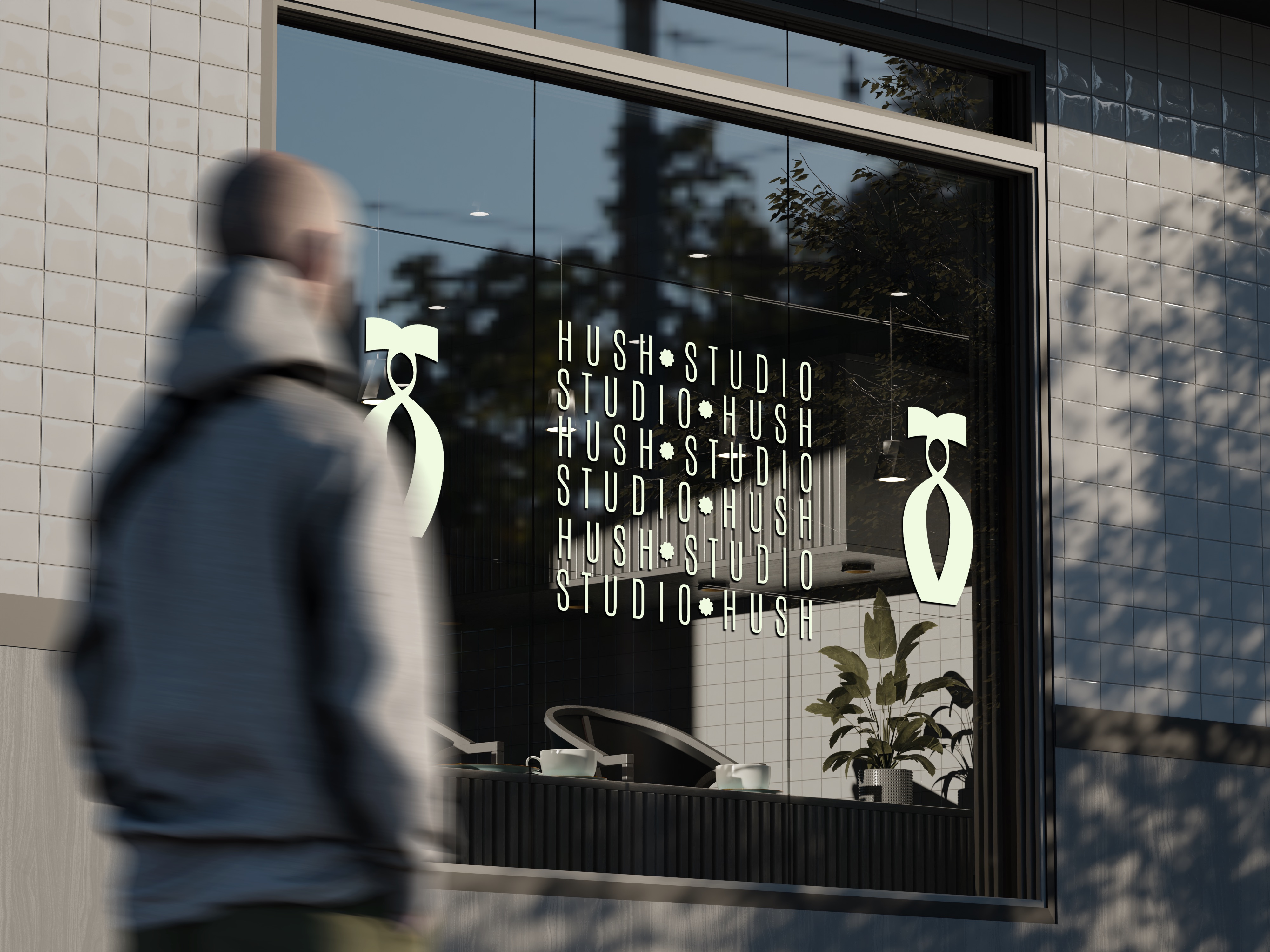
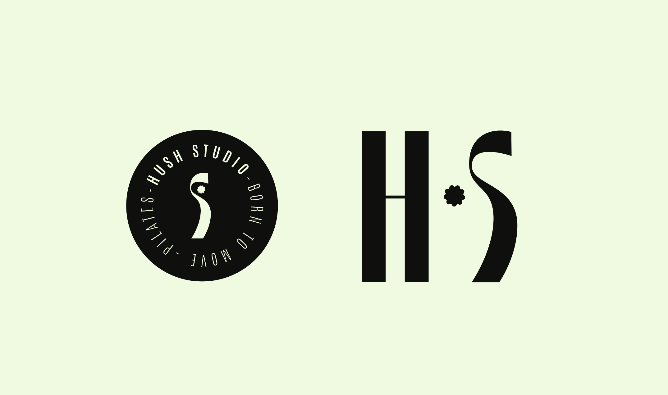
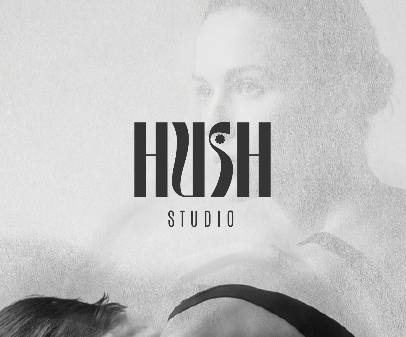
The brand identity is defined by a reduced color palette, strong typographic contrast and expressive imagery. Movement is not shown through action alone, but through composition, rhythm and negative space. Graphic elements and logo variations were designed to work flexibly across print, digital and spatial applications. The system allows the brand to shift between softness and strength while remaining unmistakably recognizable.