Überblick
AREAL kam in einer Wachstumsphase auf mich zu. Das Unternehmen hat sich weiterentwickelt, größere Projekte übernommen und eine breitere Zielgruppe angesprochen, aber die bestehende Marke hat das nicht mehr abgebildet. Die Aufgabe war nicht nur visuell, sondern strukturell: Botschaft, Design und digitaler Auftritt waren nicht konsistent. Ich habe ein Fundament geschaffen, das AREAL eine klare Positionierung gibt und mitwachsen kann.
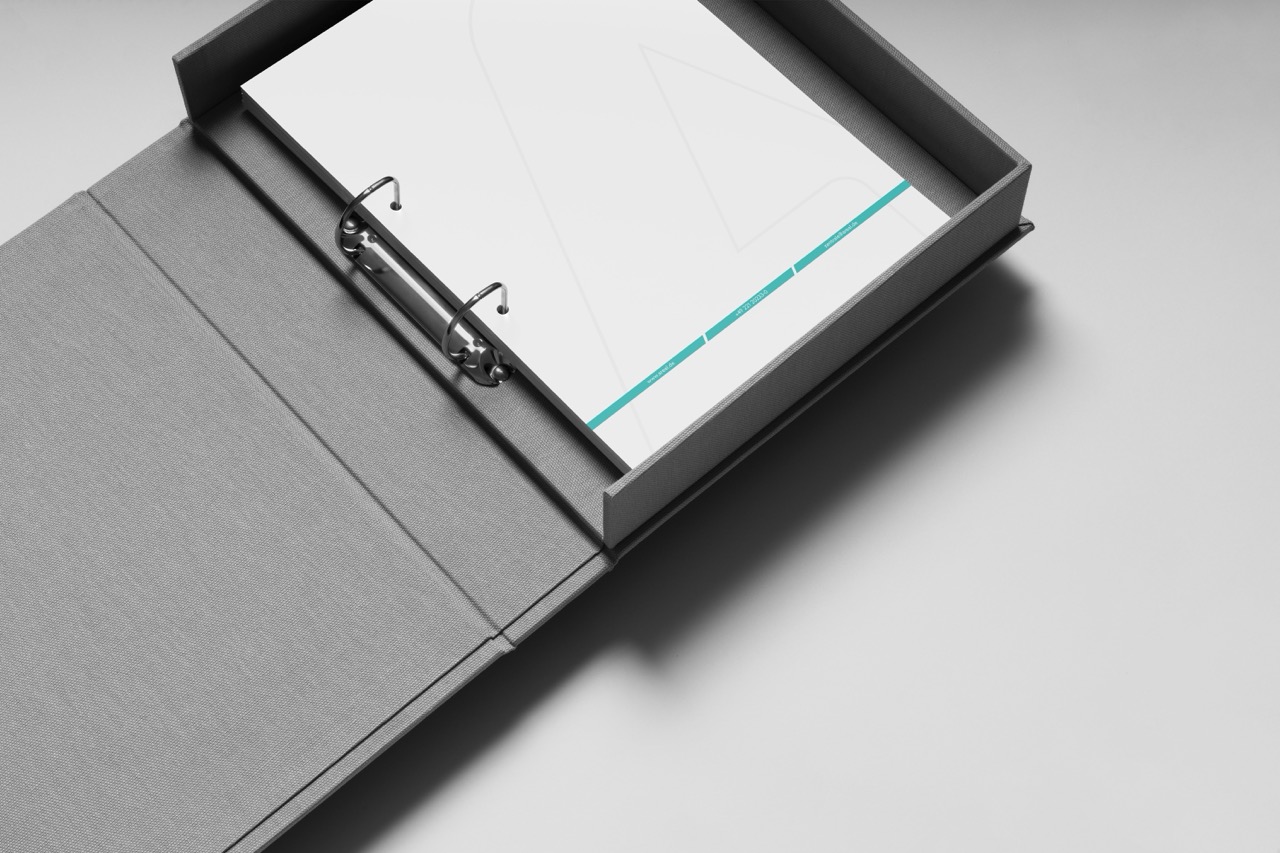
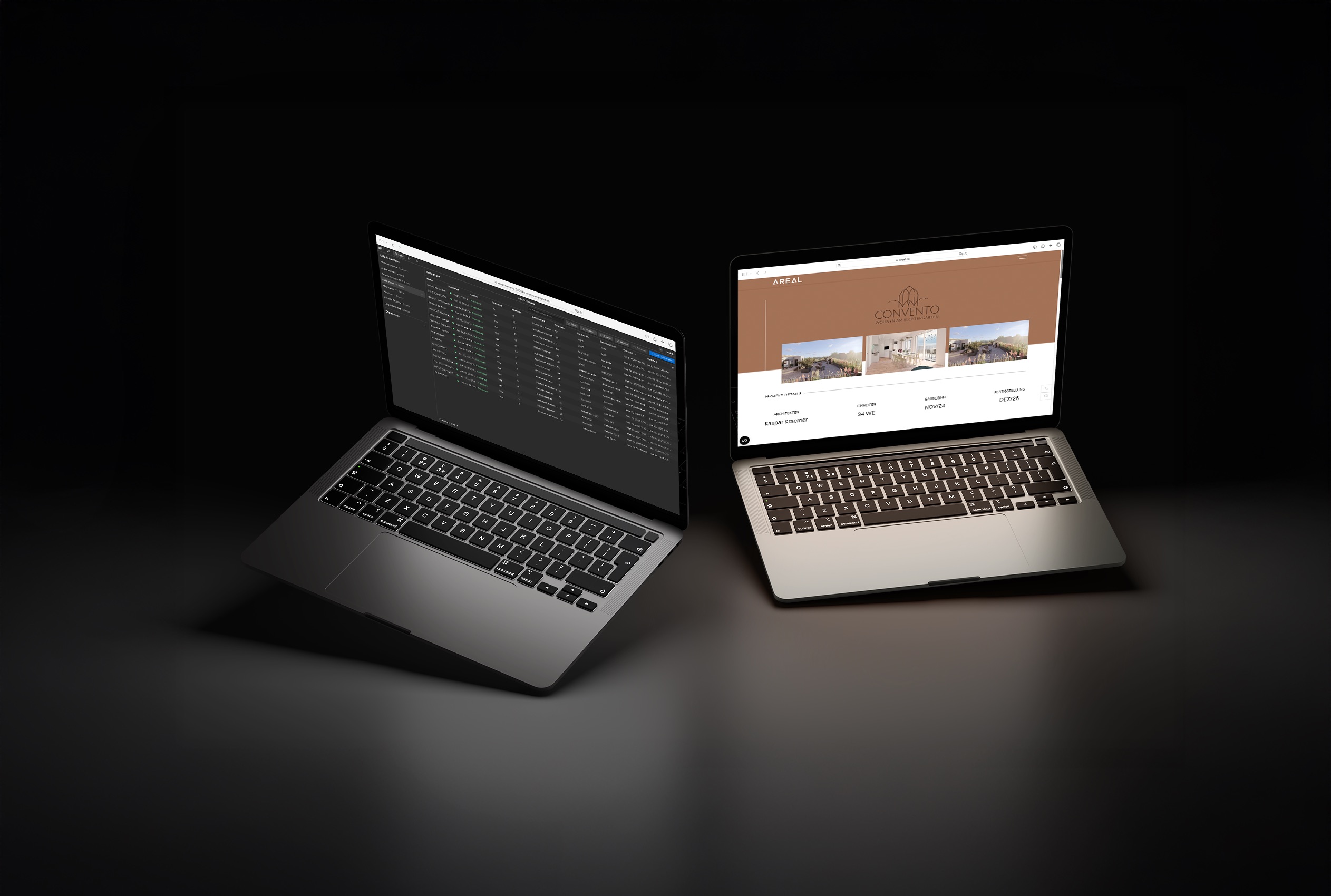
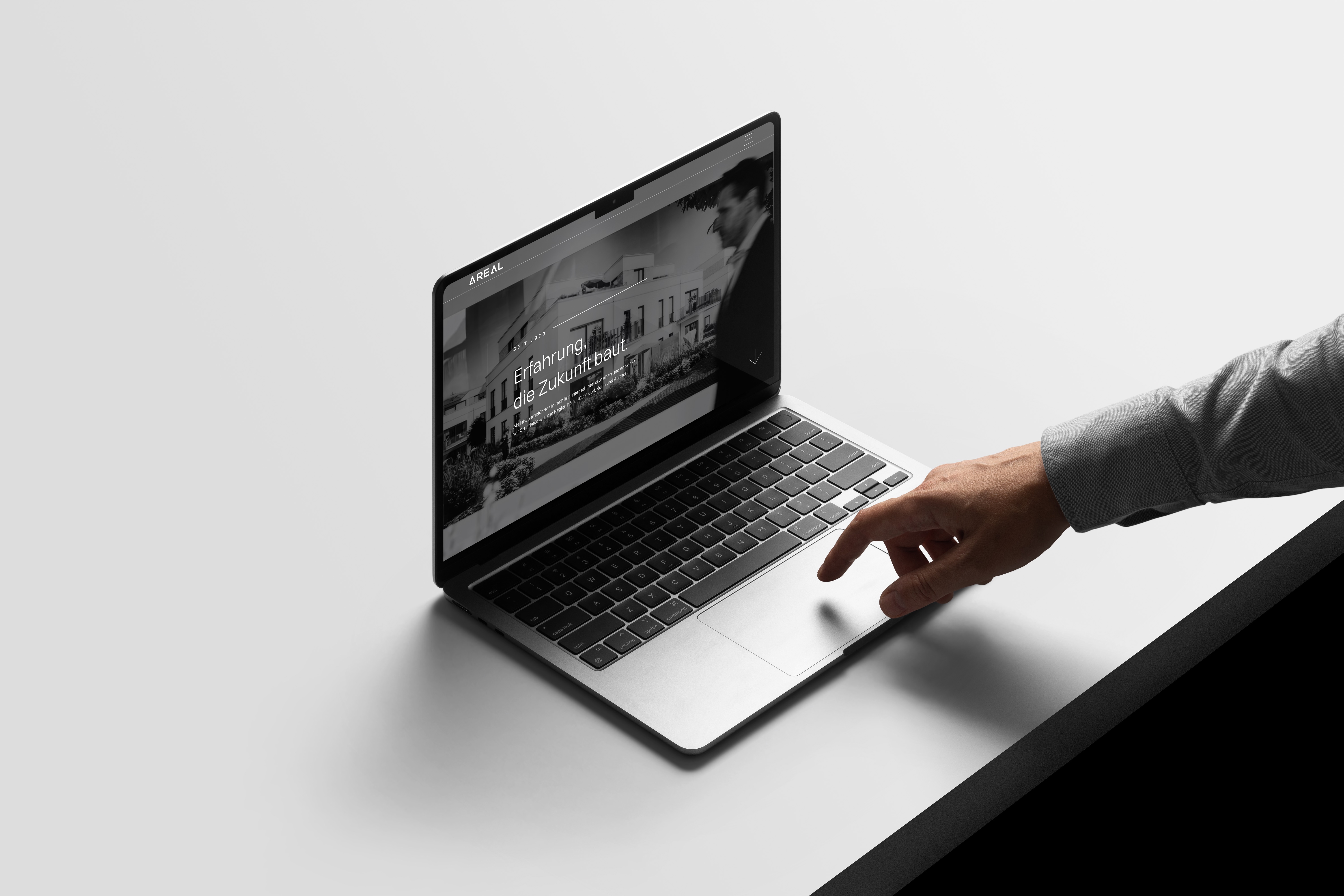
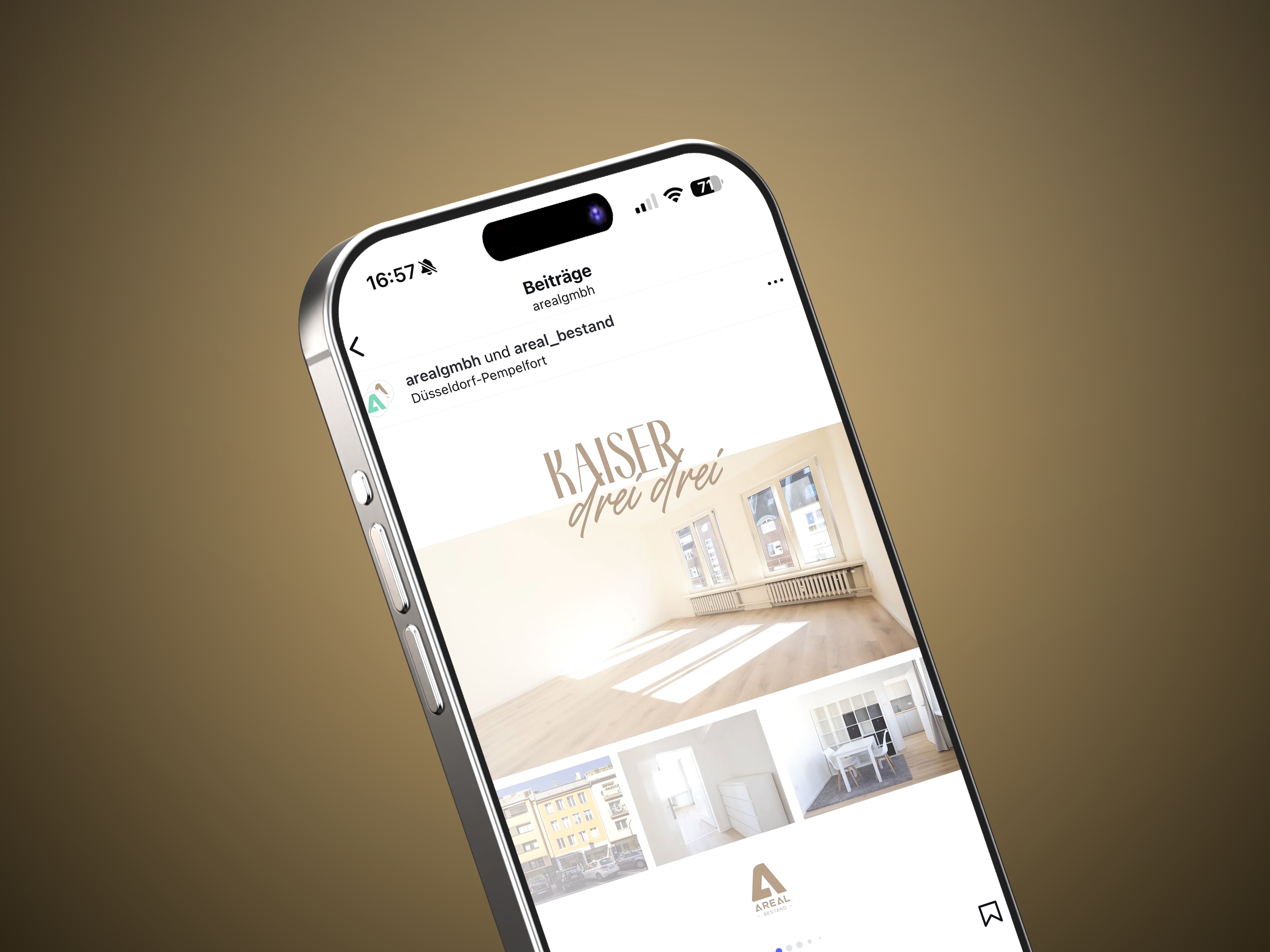
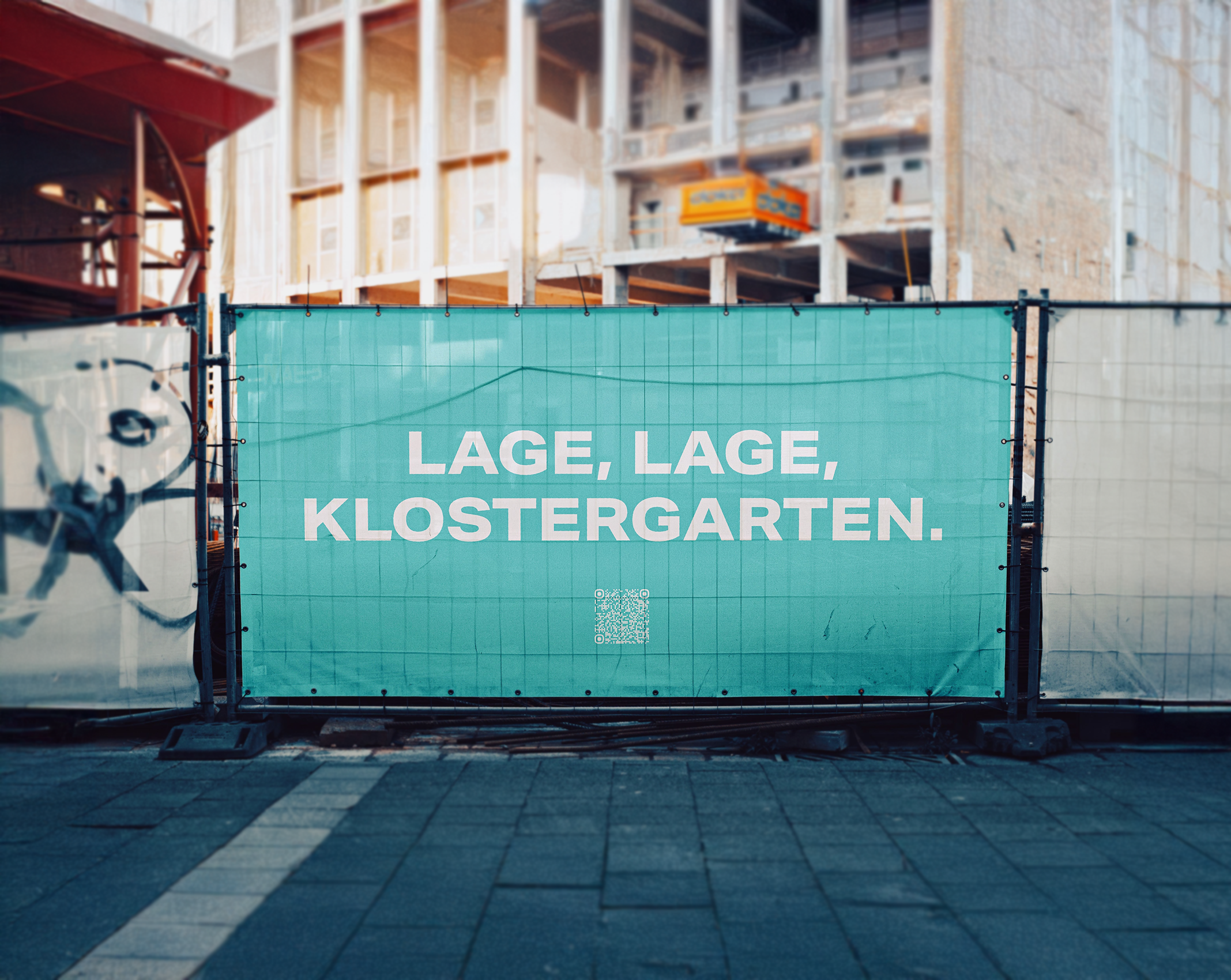
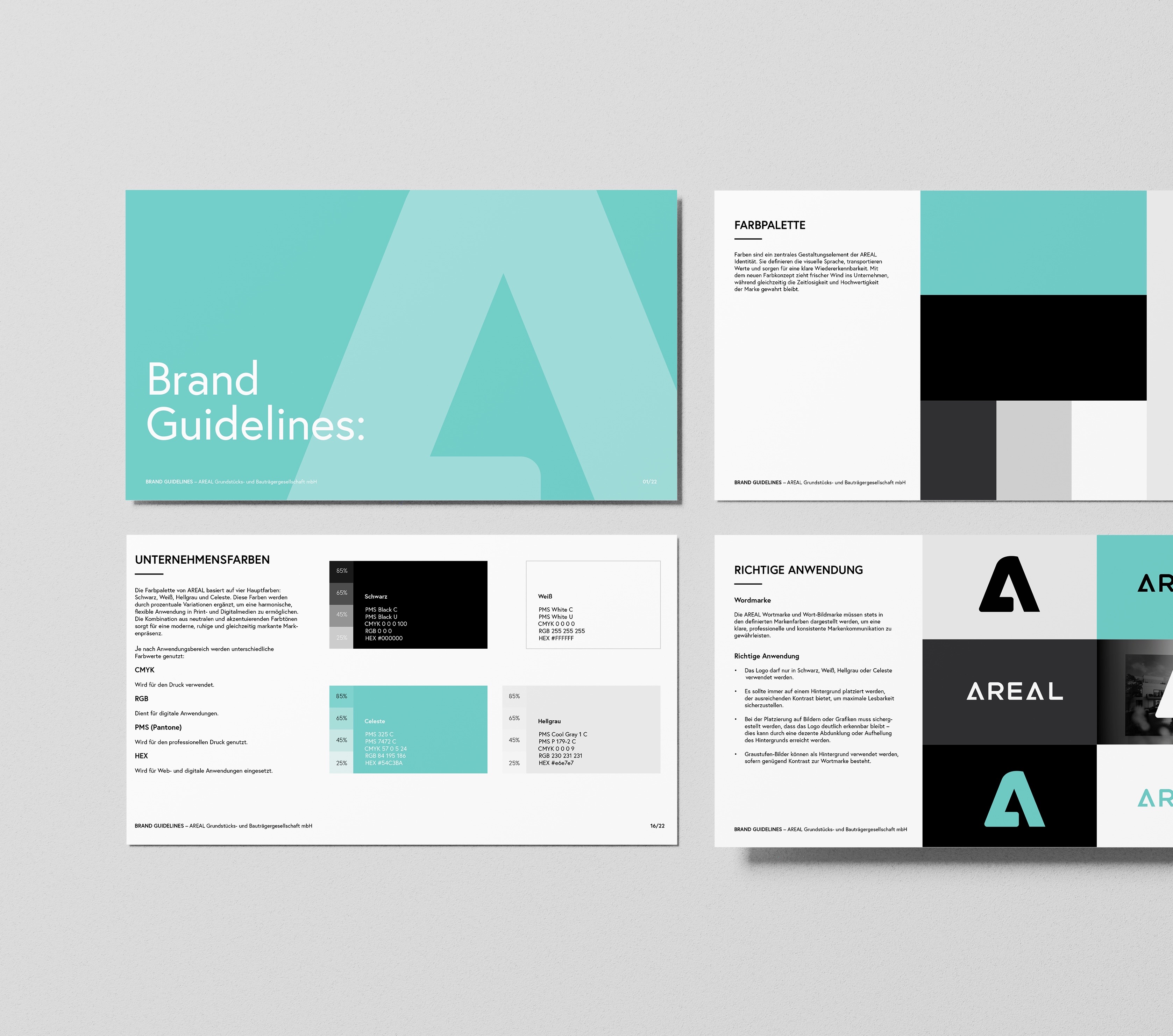
Entstanden ist eine geschärfte Markenidentität, die auf Klarheit, Balance und Selbstbewusstsein setzt. Typografie, Farben und Layout-Prinzipien ergeben eine ruhige, verlässliche Bildsprache, die digital wie im Print funktioniert. Über das Rebranding hinaus betreue ich AREAL weiter, bei Website, gestalterischer Weiterentwicklung und neuen Anwendungen. Genau diese laufende Zusammenarbeit hält die Marke konsistent.